· tips · 8 min read
Exploring the Shadow DOM: Secrets Behind Web Components
Learn how the Shadow DOM isolates markup and styles inside web components. This deep dive covers attachShadow, :host, ::slotted, ::part, CSS variables for theming, event retargeting, closed vs open shadow roots, and practical examples you can copy and adapt.
Introduction - what you’ll achieve
By the end of this article you’ll be able to build small, robust web components whose markup and styles are reliably encapsulated. You’ll see how to prevent style leakage in both directions, expose safe styling hooks for consumers, and debug common pitfalls. Read on to create components that behave predictably-everywhere.
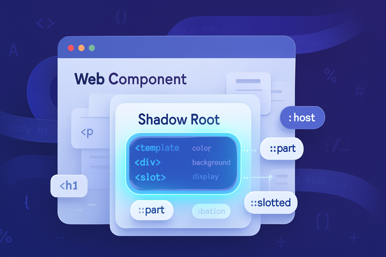
What is the Shadow DOM (briefly)
The Shadow DOM is a browser API that gives a DOM subtree its own separate scope for markup and style. It’s one of the three pillars of Web Components (the others are Custom Elements and HTML Templates). With Shadow DOM you can:
- Encapsulate internal structure so it doesn’t collide with page CSS.
- Avoid leaking internal styles to the outer document.
- Expose a controlled API for styling and structure.
In practice that means you can build a “button-like” custom element without worrying that page CSS or other libraries will accidentally change its internal parts.
For an authoritative reference, see MDN’s Shadow DOM docs: https://developer.mozilla.org/docs/Web/Web_Components/Using_shadow_DOM
Core concepts and keywords
- attachShadow({ mode: ‘open’ | ‘closed’ }) - create a shadow root attached to an element. ‘open’ makes shadowRoot accessible via element.shadowRoot; ‘closed’ hides it.
- Shadow root - the root node that owns the isolated subtree.
- :host - a CSS selector for the host element (the element the shadow root is attached to).
- ::slotted(selector) - style nodes provided by the light DOM through
elements. - ::part(name) - style named parts exposed by a component.
- CSS custom properties (variables) - inherit across the shadow boundary and are the recommended theming bridge.
- Event retargeting - events coming from inside a shadow root appear to originate at the shadow host to the outside world.
Quick example - encapsulated counter component
Below is a minimal custom element with a shadow root and encapsulated styles.
<my-counter></my-counter>

<script>
  class MyCounter extends HTMLElement {
    constructor() {
      super();
      const shadow = this.attachShadow({ mode: 'open' });
      shadow.innerHTML = `
      <style>
        :host { display: inline-block; font-family: system-ui; }
        button { background: var(--counter-bg, #007bff); color: white; padding: 0.5rem 1rem; border: none; border-radius: 4px; }
        span { display: inline-block; width: 2rem; text-align: center; margin: 0 0.5rem; }
      </style>
      <button id="decr">-</button>
      <span id="value">0</span>
      <button id="incr">+</button>
    `;

      this._value = 0;
      this._valueEl = shadow.getElementById('value');
      shadow
        .getElementById('incr')
        .addEventListener('click', () => this._update(1));
      shadow
        .getElementById('decr')
        .addEventListener('click', () => this._update(-1));
    }

    _update(delta) {
      this._value += delta;
      this._valueEl.textContent = this._value;
      this.dispatchEvent(
        new CustomEvent('change', { detail: { value: this._value } })
      );
    }
  }
  customElements.define('my-counter', MyCounter);
</script>
Why this matters: the button styles live inside the shadow root. Global CSS on the page cannot override them. The component is self-contained.
Styling the host from inside the shadow
Use the :host selector to apply styles to the custom element itself from within its shadow. You can also match conditions on the host, e.g. attributes or classes.
:host {
  display: block;
}
:host([disabled]) {
  opacity: 0.6;
  pointer-events: none;
}
:host(.compact) {
  font-size: 0.85rem;
}
:host([theme='dark']) {
  --counter-bg: #333;
}
The :host-context(selector) selector lets a component react to an ancestor in the page outside the shadow, though it’s best used sparingly - it weakens encapsulation.
Allowing consumers to style parts safely: ::part
Because styles in the page don’t pierce a shadow root, you need a controlled escape hatch to allow the consumer to change visuals. The part attribute plus ::part() selector is the recommended mechanism.
Inside the shadow:
<button part="control">Click</button>Outside (in the page stylesheet):
my-component::part(control) {
  background: linear-gradient(#f0f, #aaf);
}
This keeps internal markup private while allowing targeted visual customization.
Accepting slotted content:and ::slotted()
Slots are placeholders inside a shadow root where consumers can inject DOM.
Shadow HTML:
<slot name="label">Default label</slot>Consumer HTML:
<my-component>
  <span slot="label">Custom label</span>
</my-component>
To style slotted descendants from inside the shadow use ::slotted() but note it’s limited to matching top-level slotted nodes only:
::slotted(span) {
  color: purple;
}
This selector cannot match deep descendants inside the slotted node (beyond that top node). If you need to style nested nodes in slotted content, style them from the consumer side or have the consumer add classes.
Theming and safe escape: CSS custom properties
CSS custom properties are the canonical way for components to accept theme values. They cross the shadow boundary via normal inheritance.
Inside component’s stylesheet:
:host {
  --primary: #007bff;
}
button {
  background: var(--primary);
}
Consumer can override:
my-component {
  --primary: #ff6600;
}
This provides a safe, predictable way to tweak colors, spacing, or type-scale without breaking encapsulation.
Important note: custom properties behave like inherited values - they follow normal cascade and inheritance rules.
Preventing style leakage: common pitfalls and fixes
Global selectors targeting tag names
- Problem: If a page has
button { font-weight: 700 }, your shadow button will not be affected - good. But if your component relies on a global reset (e.g.,*, *::before, *::after { box-sizing: border-box }) it won’t receive it. - Fix: Add required resets inside the shadow or rely on explicit styles in the component.
- Problem: If a page has
Font inheritance and fallback
- Some inherited properties (like
colorandfont-family) do cross into a shadow root via inheritance. If you want a component to always use a specific font, set it explicitly inside the shadow.
- Some inherited properties (like
Using deep combinators (deprecated)
- Older patterns used
/deep/or::shadow(removed). Don’t rely on these; they’re deprecated.
- Older patterns used
Styling slotted content too deeply
::slotted()only matches top-level slotted nodes. If you need to style internals of slotted content, ask consumers to apply classes or style them from outside.
CSS specificity surprises
- Styles added inside the shadow have their own cascade. If you expose parts via
::part, that exposed styling is still subject to CSS specificity rules of the outer document.
- Styles added inside the shadow have their own cascade. If you expose parts via
Events, retargeting and focus behavior
Events originating in the shadow DOM are retargeted at the shadow host when observed from the outside. This prevents leaking internal structure via event.target. If you dispatch a custom event and want it to be observed with the original target, include composed: true.
this.dispatchEvent(
  new CustomEvent('example', { detail: {}, bubbles: true, composed: true })
);
Focus: use delegatesFocus: true when calling attachShadow to have focus delegation (helpful for components like text-field that forward focus to an internal input).
this.attachShadow({ mode: 'open', delegatesFocus: true });Open vs closed shadow roots - tradeoffs
- open: allows external code (and DevTools) to access
el.shadowRoot. Good for debugging and libraries. - closed:
el.shadowRootis null; the shadow still exists but is not reachable via the property. This raises the bar for introspection and testing.
Closed shadows do not make components truly secure - they only hide the reference; anything that can run in the page can still interact via the public API you expose.
Use closed only if you have a clear reason to hide internals; open is usually preferable for transparency and testability.
AdoptedStyleSheets (Constructable Stylesheets)
The constructable stylesheet API (CSSStyleSheet and adoptedStyleSheets) lets you create and share stylesheet instances, reducing duplication and improving performance when many components use the same styles.
const sheet = new CSSStyleSheet();
sheet.replaceSync(':host { display: block } button { padding: 8px }');
shadow.adoptedStyleSheets = [sheet];
Browser support is good in modern Chromium and Firefox. If you target older browsers, include a fallback or polyfill. See https://web.dev/constructable-stylesheets/ for details.
Debugging tips
- Use browser DevTools to inspect a node’s shadow root (Elements panel shows the shadow tree). In closed mode you still see it in DevTools but JavaScript can’t access
shadowRoot. - In the console, select a node with $0 and inspect
$0.shadowRootwhen mode is open. - Look for specificity issues by checking computed styles.
Browser support and polyfills
Shadow DOM v1 is supported by modern browsers (Chrome, Edge, Firefox, Safari). Older browsers (notably IE) are not supported. If you need compatibility you can use the official polyfills from the Web Components project: https://github.com/webcomponents/polyfills or the legacy polyfill bundle at https://github.com/webcomponents/webcomponentsjs
For a readable compatibility guide, see https://caniuse.com/mdn-api_shadowroot
Walkthrough: a themed card that exposes only a button part
Let’s build a fancy-card that keeps internals private but allows the outer page to style the action button color via ::part and set a label slot.
<fancy-card>
  <span slot="title">Welcome</span>
  <p slot="body">This is a short description.</p>
</fancy-card>

<script>
  class FancyCard extends HTMLElement {
    constructor() {
      super();
      this.attachShadow({ mode: 'open' });
      this.shadowRoot.innerHTML = `
      <style>
        :host { display: block; border-radius: 8px; box-shadow: 0 6px 18px rgba(0,0,0,0.12); padding: 1rem; background: var(--card-bg, white); color: var(--card-color, #222); }
        header { font-weight: 600; margin-bottom: 0.5rem; }
        .actions ::slotted(button) { /* fall back styling for slotted buttons */ }
        button[part] { padding: 0.5rem 0.75rem; border: none; border-radius: 6px; }
      </style>
      <header><slot name="title">Title</slot></header>
      <div><slot name="body">Body content</slot></div>
      <div class="actions"><button part="action">Default action</button></div>
    `;
    }
  }
  customElements.define('fancy-card', FancyCard);
</script>
Consumer styling:
fancy-card {
  --card-bg: #0f172a;
  --card-color: #fff;
}

/* target the action button only - safe, explicit */
fancy-card::part(action) {
  background: linear-gradient(90deg, #ff7a18, #af002d);
  color: white;
}
This keeps layout and structure private while still allowing the outer page to theme the button via ::part and the card using CSS variables.
Best practices summary
- Prefer CSS custom properties for theming and tokens.
- Expose styling hooks using
partrather than allowing global selectors to reach inside. - Use
::slotted()responsibly; remember it only targets slotted top nodes. - Keep a small, well-documented public API (attributes, properties, events).
- Use
delegatesFocusfor focus-forwarding components. - Prefer
mode: 'open'for easier debugging unless you have a specific reason not to. - Consider adoptiveStyleSheets for shared styles in modern browsers.
Final thoughts - encapsulation, but not isolation
Shadow DOM gives you strong encapsulation for markup and CSS. It solves many integration headaches by making components resilient to the page’s global styles. But it’s not magic. You still design clear public APIs (attributes, properties, events, CSS variables, parts) for consumer control. Use those APIs to strike a balance between hiding implementation details and letting consumers customize appearance.
Further reading
- MDN: Using the Shadow DOM - https://developer.mozilla.org/docs/Web/Web_Components/Using_shadow_DOM
- Web.dev: Constructable Stylesheets - https://web.dev/constructable-stylesheets/
- Web Components polyfills - https://github.com/webcomponents/polyfills