· 5 min read
The Accessibility Conversation: Making Tailwind CSS Projects Inclusive
A practical guide to building accessible applications with Tailwind CSS - patterns, common mistakes to avoid, Tailwind-specific tips, and a checklist to ship inclusive UIs.
Introduction
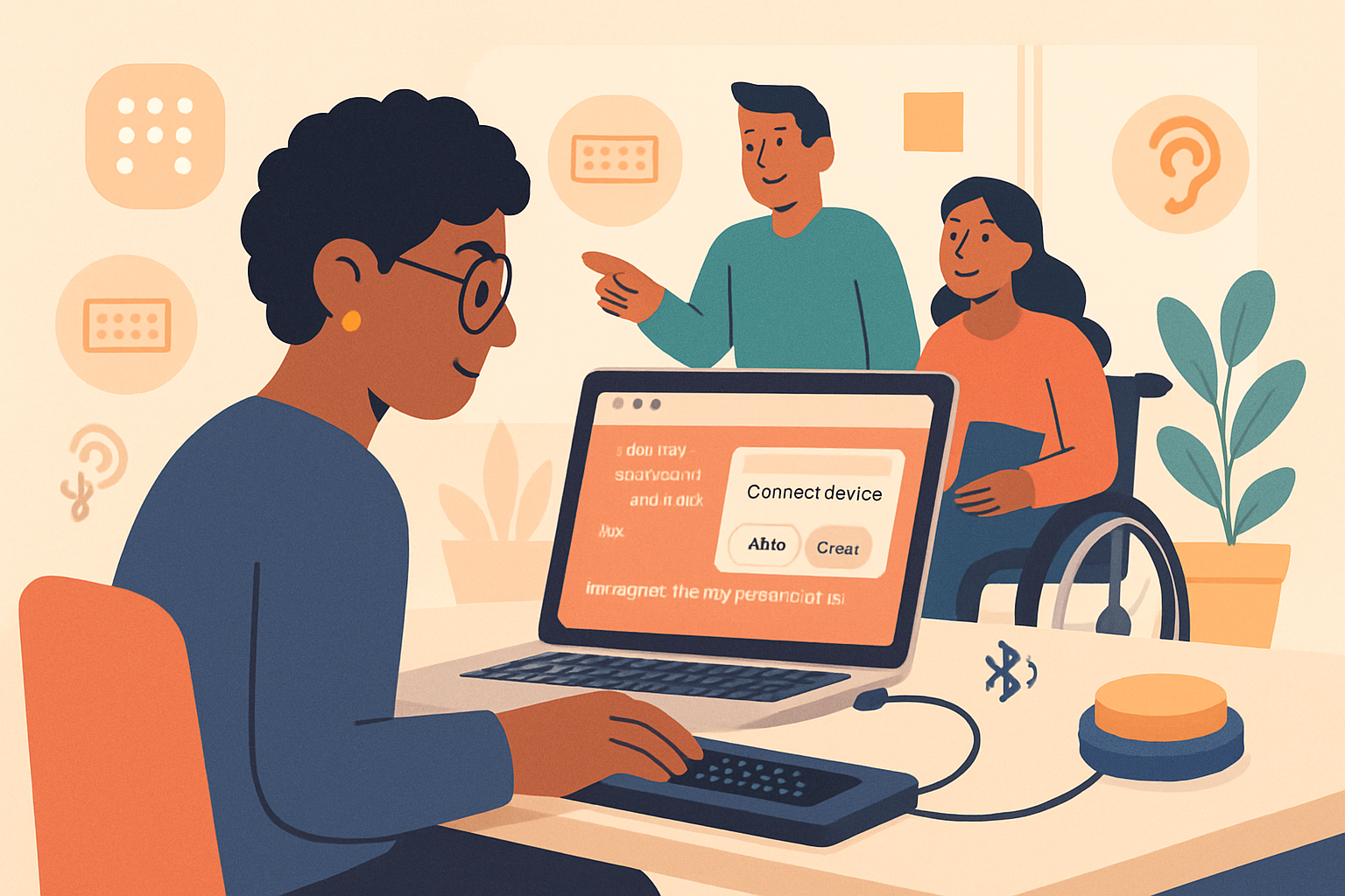
Accessibility isn’t an optional extra - it’s a baseline requirement for building robust, usable products. Tailwind CSS gives you a fast, utility-first way to style apps, but utilities don’t magically make an interface accessible. This post walks through accessible-by-default patterns you can apply with Tailwind, common pitfalls to avoid, and practical code snippets you can drop into projects today.
Why accessibility matters (brief)
- Ethical: People with disabilities should be able to use the web.
- Legal/compliance: Many regions require adherence to standards like WCAG.
- Business: Accessible sites reach more users and often have better SEO and usability.
Read the standards: the W3C’s WCAG overview is the canonical guide to accessibility WCAG - W3C.
Tailwind-specific accessibility principles
- Start with semantics
Tailwind is for styling - semantic HTML and ARIA come first. Use <button>, <label>, <nav>, <main>, and heading structure correctly. Styling should never replace semantics (for example, don’t use <div role=“button”> unless you must).
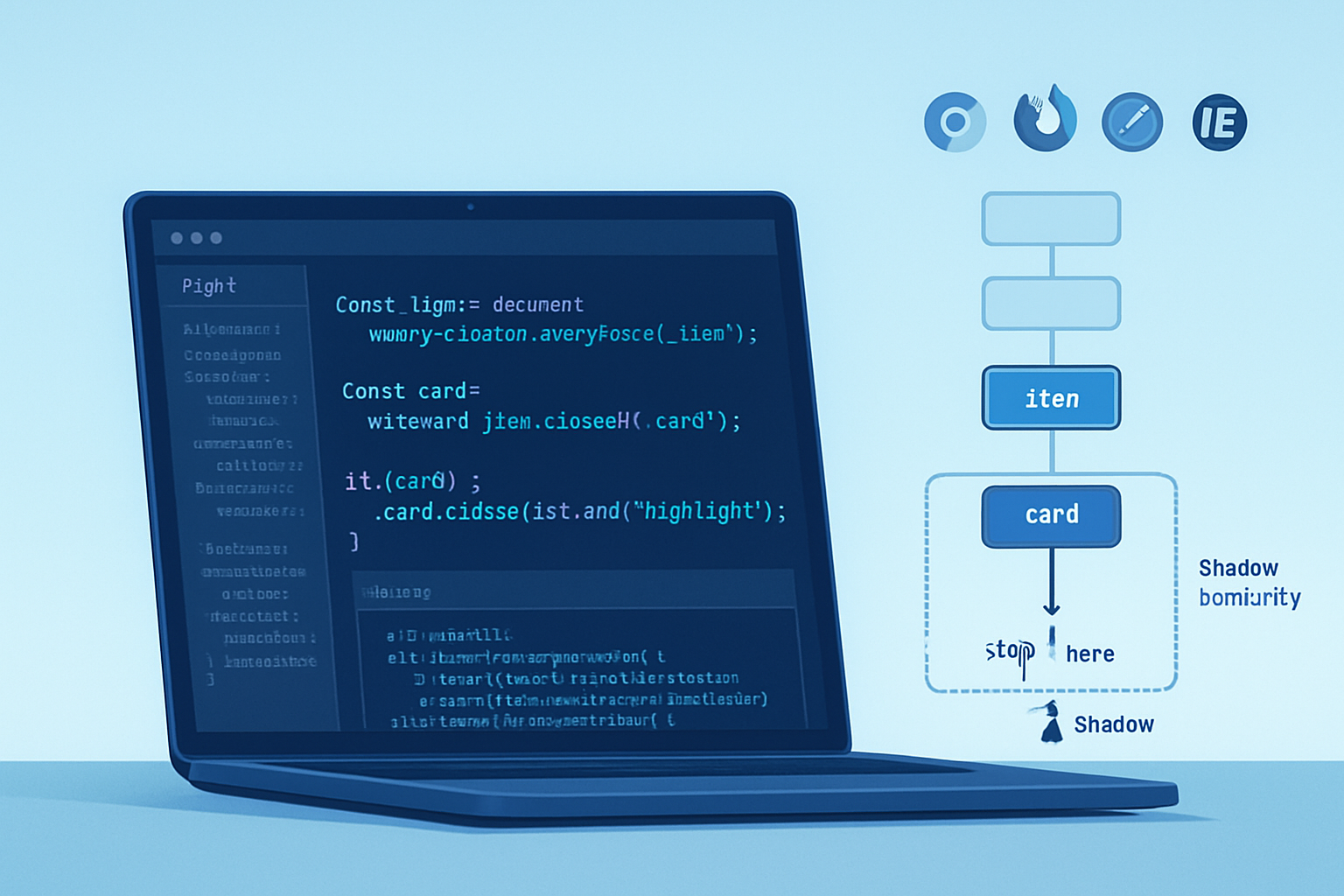
- Preserve focus visibility
Browsers show focus outlines for keyboard users. Avoid removing them with focus:outline-none unless you replace them with an accessible visual focus state (for example, a visible ring). Use Tailwind’s ring utilities rather than hiding outlines.
Example - accessible button focus state:
<button
  class="px-4 py-2 bg-blue-600 text-white rounded-md
         focus:outline-none focus-visible:ring-4 focus-visible:ring-blue-300"
>
  Save
</button>
Notes:
- Use
:focus-visibleto show focus for keyboard users and avoid visual noise for mouse users (see MDN on :focus-visible) MDN - :focus-visible. - Tailwind supports the
focus-visiblevariant.
- Color contrast and accessible color choices
Tailwind’s default palette is useful, but always check contrast ratios for text and UI elements. Aim for at least 4.5:1 for normal text and 3:1 for large text per WCAG AA. Use tools like WebAIM’s contrast checker WebAIM Contrast Checker.
You can customize colors in tailwind.config.js to define accessible palette tokens:
// tailwind.config.js
module.exports = {
  theme: {
    extend: {
      colors: {
        'brand-900': '#0b3d91', // tested to meet contrast
        'brand-100': '#e6effc',
      },
    },
  },
};- Respect reduced motion preferences
Some users have vestibular disorders and prefer reduced motion. Tailwind includes the motion-safe and motion-reduce variants for this.
Example - conditional animation:
<div
  class="transition-transform duration-300 motion-reduce:transition-none motion-reduce:transform-none motion-safe:translate-y-0"
>
  <!-- animated content here -->
</div>
Reference: MDN on @media (prefers-reduced-motion) MDN - prefers-reduced-motion.
- Use Tailwind utilities for screen-reader visibility
Tailwind ships the sr-only utility for content that should be read by screen readers but hidden visually. There are also utilities like invisible and hidden for presentation-level hiding, but understand their differences.
Common mistakes and how to avoid them
Hiding focus outlines without replacement
- Problem: Keyboard users lose visible focus. Fix: Use
focus-visiblewith accessible ring or outline.
- Problem: Keyboard users lose visible focus. Fix: Use
Styling non-semantic elements to look like controls
- Problem:
divs styled as buttons break keyboard and assistive behavior. Fix: Prefer native elements or implement full ARIA + keyboard handlers if you must use custom elements.
- Problem:
Relying purely on color to convey meaning
- Problem: Users with color blindness or screen readers miss color-only information. Fix: Add icons, text labels, or visually hidden text.
Neglecting aria-live/dynamic content
- Problem: Screen readers may not announce content changes. Fix: Use
aria-liveregions for important updates.
- Problem: Screen readers may not announce content changes. Fix: Use
Practical patterns with Tailwind
- Skip-to-content link
A skip link is one of the simplest wins for keyboard and screen-reader users.
<a
  href="#main"
  class="sr-only focus:not-sr-only focus:absolute focus:top-4 focus:left-4
  focus:bg-white focus:px-3 focus:py-2 focus:rounded focus:ring-2 focus:ring-blue-400"
>
  Skip to main content
</a>

<main id="main">…</main>- Accessible form controls
Use <label> associated with inputs, and prefer the official Tailwind forms plugin to normalize styles while preserving accessibility.
Plugin: Tailwind CSS Forms plugin.
<label for="email" class="block text-sm font-medium text-gray-700">Email</label>
<input
  id="email"
  name="email"
  type="email"
  required
  class="mt-1 block w-full rounded-md border-gray-300 shadow-sm
         focus:ring-blue-500 focus:border-blue-500"
/>- Modals and dialogs
Accessibility for modals requires more than styling. Key requirements:
- Use semantic role:
role=“dialog”andaria-modal=“true” - Trap focus inside the dialog while it is open (JS)
- Return focus to the element that opened the dialog when closed
- Hide background content from assistive tech (e.g.,
aria-hidden)
A simple markup example (focus management and trapping must be implemented in JS):
<div
  role="dialog"
  aria-modal="true"
  aria-labelledby="dialog-title"
  class="fixed inset-0 flex items-center justify-center"
>
  <div class="bg-white rounded-lg p-6 shadow-lg w-full max-w-lg">
    <h2 id="dialog-title" class="text-lg font-medium">Dialog title</h2>
    <p class="mt-2">Dialog content…</p>
    <button class="mt-4 px-4 py-2 bg-blue-600 text-white rounded">Close</button>
  </div>
</div>
For robust implementations consider proven libraries like Headless UI, which provides accessible primitives that pair well with Tailwind: Headless UI.
- Keyboard-first navigation and menus
Ensure interactive components are reachable by keyboard and expose state via ARIA when needed (e.g., aria-expanded on disclosure controls). Avoid hiding content off-screen without proper ARIA semantics.
Testing and automation
Automated tools
- axe-core (Deque) - integrates with browser and test runners: axe-core
- Lighthouse - built into Chrome DevTools for accessibility audits: Lighthouse
- WAVE by WebAIM - visual accessibility testing: https://wave.webaim.org/
Manual tests
- Keyboard testing: Tab through every interactive element; all interactive controls should be reachable and usable.
- Screen reader testing: Test with VoiceOver (macOS/iOS), NVDA/JAWS (Windows), TalkBack (Android) for critical flows.
- Contrast checks: Use contrast checkers like WebAIM’s tool mentioned earlier.
Accessibility checklist for Tailwind projects
- Use semantic HTML for structure and controls
- Provide visible focus styles (use ring utilities instead of removing outlines)
- Verify color contrast ratios meet WCAG levels
- Add alternative text for images and descriptive link text
- Ensure keyboard focus order is logical and includes all interactive elements
- Use ARIA only when semantics aren’t enough; keep ARIA attributes accurate
- Respect prefers-reduced-motion and provide motion-safe fallbacks
- Test with automated tools (axe, Lighthouse) and manual screen-reader/keyboard tests
Useful references
- Tailwind CSS docs: general utilities, forms plugin, and sr-only utility - https://tailwindcss.com/docs
- WCAG standards - https://www.w3.org/WAI/standards-guidelines/wcag/
- WAI-ARIA overview - https://www.w3.org/WAI/standards-guidelines/aria/
- MDN - :focus-visible and prefers-reduced-motion docs: https://developer.mozilla.org/
- Headless UI (accessible primitives for Tailwind): https://headlessui.dev/
- axe-core accessibility testing: https://www.deque.com/axe/
- WebAIM contrast checker: https://webaim.org/resources/contrastchecker/
Conclusion
Tailwind CSS speeds up styling, but accessibility requires deliberate decisions: semantic markup, visible focus, color-contrast checks, reduced-motion support, and correct ARIA usage. By combining Tailwind’s utilities with accessibility best practices, you can build interfaces that are fast to develop and usable for everyone.
Keep accessibility in your development workflow - test early, automate checks, and favour semantics over clever styling shortcuts.