· frameworks · 6 min read
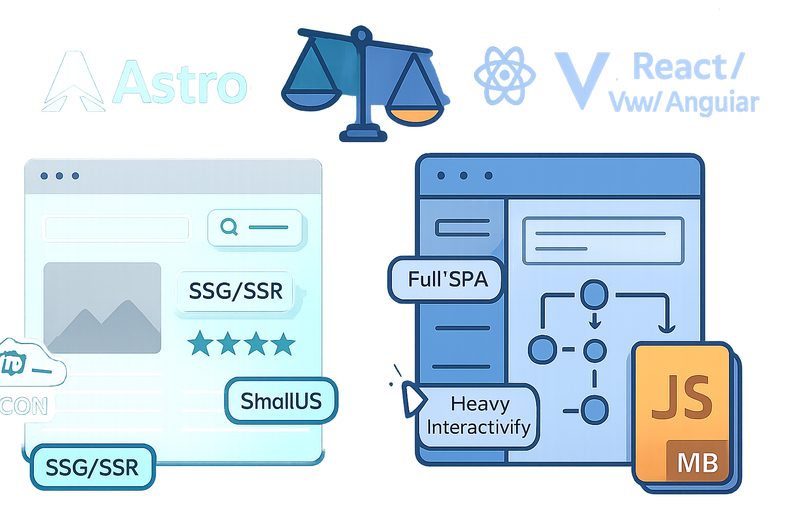
Maximizing Performance: Astro's Secret Weapon
Discover lesser-known Astro optimizations - from smart hydration directives to critical CSS inlining, image strategies, and build-time tricks - that can make your static sites feel instant.

Outcome: Make your Astro-built static site feel instant. Not just fast - instant.
You will learn a set of practical, lesser-known techniques that reduce JavaScript, cut render time, and improve perceived speed - without sacrificing interactivity.
Why this matters
Users abandon slow pages. Core Web Vitals and real-world engagement metrics reward pages that render quickly and remain responsive. Astro already gives you a huge advantage by default: its islands architecture and SSG-first approach keep JavaScript out of the initial payload. But the biggest wins come from small, surgical optimizations that most projects overlook.
What you’ll get from this post
- Concrete, actionable techniques you can apply today
- Code examples for Astro-specific features (hydration directives, images, fonts)
- Build and deploy tips to keep your static assets fast and cache-friendly
Quick roadmap
Reduce and delay hydration
Optimize images and media
Trim CSS and critical-path resources
Analyze and shrink bundles
Build-time and deploy-time optimizations
Reduce and delay hydration - make JS a privilege, not a requirement
Astro’s island model already limits JavaScript to interactive components. But how and when components hydrate matters. Use the client hydration directives intentionally.
Key directives and uncommon use-cases
- client:idle - hydrate when the browser is idle. Great for widgets that can wait (analytics UI, non-critical interactive helpers).
- client:visible - hydrate only when the component becomes visible in the viewport. Perfect for below-the-fold interactive sections.
- client:media - hydrate only when a media query matches (for example, hydrate a large desktop-only component only on wide screens).
- client:load - hydrate after the page load event (useful for things that can wait but must be ready soon after load).
- client:only - instructs Astro to only load a framework runtime on the client (useful for rare cases where a whole framework is required for an embedded app).
Examples
Hydrate a chat widget only when visible:
---
import ChatWidget from '../components/ChatWidget.jsx'
---
<ChatWidget client:visible />
Load a heavy analytics UI on idle:
<AnalyticsDashboard client:idle />Conditionally hydrate by viewport:
<Player client:media="(min-width: 1024px)" />Why these reduce real cost
Delaying hydration reduces initial CPU and network spikes. That yields better First Contentful Paint (FCP) and First Input Delay (FID), because the main thread is free to render static HTML first. Use client:visible and client:media to make hydration demand-driven, not blanket-driven.
- Images and media - cheap wins that compound
Images are the most common cause of heavyweight pages. Use these lesser-known but high-impact practices.
Responsive formats + modern codecs
- Deliver AVIF/WebP with fallbacks. Modern formats can cut file size dramatically.
- Always use srcset and sizes to let the browser pick the right resolution.
Example responsive image markup
<picture>
  <source
    type="image/avif"
    srcset="/images/hero-400.avif 400w, /images/hero-800.avif 800w"
    sizes="(max-width: 600px) 100vw, 50vw"
  />
  <source
    type="image/webp"
    srcset="/images/hero-400.webp 400w, /images/hero-800.webp 800w"
    sizes="(max-width: 600px) 100vw, 50vw"
  />
  <img src="/images/hero-800.jpg" alt="Hero" loading="lazy" decoding="async" />
</picture>
Use LQIP and blurred placeholders
Low-Quality Image Placeholders (LQIP) make perceived load much faster. Show a tiny, blurred placeholder while the full image downloads. Astro has community/image integrations (and docs) to help generate responsive images and placeholders automatically - but you can also embed a base64 tiny image as the placeholder.
Lazy-load intelligently
- Add loading=“lazy” and decoding=“async” for non-critical images.
- For above-the-fold hero images, consider preloading or inlining a small critical image.
Image tooling
Use image optimization integrations (e.g. official/community Astro image plugins) or a build step that produces AVIF/WebP/optimized JPEGs and srcset variants. This avoids shipping large originals to the client.
- Trim CSS and critical-path resources
Small CSS wins are huge because CSS blocks painting.
Critical CSS inlining
Extract critical above-the-fold CSS and inline it in the head for the initial render; load the rest asynchronously. Tools like “critical” can do this during your build step.
Example build-time step (conceptual)
- Build site
- Run critical on each HTML file to extract critical CSS
- Inline critical CSS into the page head
- Load the remaining CSS with rel=preload and onload swap
Reduce unused CSS
- Use component-scoped styles (Astro component styles are scoped by default) and avoid global CSS bloat.
- If using Tailwind, enable purge/just-in-time to strip unused classes.
Font strategies
- Use font-display: swap to avoid invisible text
- Preload critical fonts with
- Consider subsetted variable fonts for reduced size
Reference: Google’s font recommendations and web.dev font loading guidance web.dev: Fonts.
- Analyze and shrink bundles - measure before you trim
You can only optimize what you measure. These are practical tools and tactics.
Bundle visualizers
- Use Vite/Rollup visualizers (rollup-plugin-visualizer) or
vite build --reportto inspect your JS output and find surprising large imports. - Look for dependency duplication and heavyweight libraries.
Dynamic imports and code splitting
- Use dynamic import() for heavy features used rarely - Astro’s build (via Vite) will split those into separate chunks.
- Example: lazy-load a charting library only when the user opens the charts panel.
Avoid accidental framework bloat
- Each framework runtime (React/Vue/Solid/Svelte) adds weight. Prefer pure Astro components for static content and only use frameworks for essential interactive islands.
- Use
client:onlywhen you absolutely must load a framework-only component, and minimize how many different framework runtimes you include.
- Build-time and deploy-time optimizations
Precompress assets
- Generate Brotli and Gzip compressed versions during your build. Many CDNs will serve the precompressed asset when they exist.
Set long cache headers
- Immutable fingerprinting (content-hash filenames) ensures you can set far-future caching for static assets. Astro’s build already fingerprints many assets; ensure your CDN or hosting honors cache headers.
Use a CDN / Edge
- Deploy static output to a global CDN (Vercel, Netlify, Cloudflare Pages). Static sites benefit hugely from edge delivery - lower latency, faster TLS negotiation, and HTTP/2.
- See Astro’s deploy guides: Astro Deploy Guides.
HTTP/2 / HTTP/3
- Hosting that supports HTTP/2 or HTTP/3 reduces multiplexing overhead and improves resource delivery. Many managed static hosts provide this for you.
Practical checklist (apply these in order)
- Audit with Lighthouse and a bundle visualizer. Find the biggest pain points.
- Convert large images to AVIF/WebP and create srcset variants. Add LQIP placeholders.
- Replace eager hydration with client:visible / client:idle / client:media where appropriate.
- Inline critical CSS. Load the rest asynchronously.
- Preload critical fonts and use font-display: swap.
- Precompress built assets (Brotli/Gzip) and deploy to a CDN.
- Re-measure. Iterate.
Advanced, lesser-known tricks
- Hydration by media query (client:media) is a powerful but underused technique - hydrate large components only on the devices that will use them.
- Use Intersection Observer patterns and client:visible together to hydrate only on user intent.
- Preload critical images or fonts that block the first meaningful paint; but be conservative - overusing preload can hurt by occupying network early and delaying other resources.
- For very large static sites, consider a build pipeline that reuses a shared image/cache layer to avoid reprocessing images on every build.
Resources and further reading
- Astro docs - Hydration and Islands: https://docs.astro.build/en/core-concepts/component-hydration/
- Astro docs - Images guide and community integrations: https://docs.astro.build/en/guides/images/
- Islands Architecture overview: https://docs.astro.build/en/core-concepts/islands-architecture/
- Font loading best practices: https://web.dev/fast/fonts/
- Critical CSS tooling: https://github.com/addyosmani/critical
- Bundle analysis: rollup-plugin-visualizer: https://www.npmjs.com/package/rollup-plugin-visualizer
Conclusion - your secret weapon
Astro’s island-first approach is your foundation. The secret weapon is intentionality: strategic hydration, smart image pipelines, critical-path trimming, and build-time optimizations. Do these, and your static site will stop feeling like a document and start feeling like an app that’s already there when the user arrives. Fast load. Low memory. Minimal JavaScript. Instant.