· deepdives · 7 min read
Mastering the Device Posture API: A Complete Guide for Developers
Learn how to detect device posture on foldable devices, implement posture-aware UI, combine the Device Posture API with Window Segments and sensors, and use fallbacks and testing strategies to deliver robust, hinge-aware experiences.
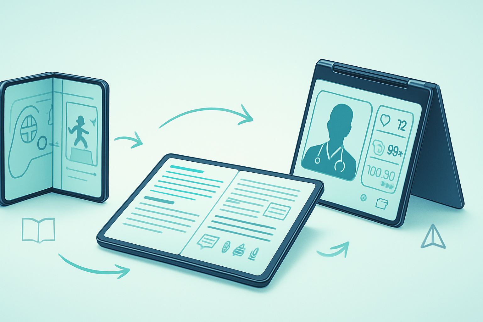
What you’ll build with this guide
You will learn how to detect a device’s physical posture on foldable devices, react to posture changes in real time, and adapt layouts and interactions so your web app feels native and natural on foldables. By the end you’ll be comfortable integrating the Device Posture API into production apps, combining it with window-segmentation techniques, and providing safe fallbacks so your UI works everywhere.
Why device posture matters
Foldables and multi-hinge devices are no longer experimental. Users want applications that take advantage of extra screen real estate without creating frustrating seams where the hinge sits. The Device Posture API lets your code understand how the device is being held or folded and respond accordingly - for example by switching to a dual-pane layout when the device is used like a book, or by avoiding placing important controls under a hinge.
Short: posture-aware apps feel polished. Long: they avoid broken interactions and use screen real estate where it matters.
The big-picture data the API gives you
Different implementations and specs evolve, but the Device Posture API (and related window segmentation tools) generally allow you to learn:
- A categorized posture state (examples: “flat”, “book”, “tent”, “folded” - actual labels depend on the runtime).
- Geometry for a hinge/fold region (a DOMRect-like object describing where the seam or hinge is on-screen).
- A hinge angle or continuous value in some implementations (useful if you need smooth transform effects).
- Change events so you can react when a posture changes.
You will often pair this with the Window Segments API that exposes how the visual area is split across hinges (segments you can layout into).
For the latest specification and reference examples see the WICG Device Posture repo and the articles on Chrome developers / web.dev:
- WICG Device Posture repository: https://github.com/WICG/device-posture
- Device Posture on web.dev / Chrome articles: https://web.dev/device-posture/ and https://developer.chrome.com/articles/device-posture/
Feature detection and progressive enhancement (pattern)
Always treat posture support as an enhancement. The pattern below shows a defensive, promise-friendly approach that reads current posture (if available) and subscribes to changes.
// Feature detect
const devicePosture = navigator.devicePosture || null;

// Fallback: single logical segment covering the whole window
function defaultSegments() {
  return [{ x: 0, y: 0, width: window.innerWidth, height: window.innerHeight }];
}

async function initPostureAwareUI() {
  // 1) Read initial posture/segments if available
  if (devicePosture?.getCurrentPosture) {
    try {
      const posture = await devicePosture.getCurrentPosture();
      applyPosture(posture);
    } catch (err) {
      console.warn('Failed to read device posture:', err);
    }

    // 2) Subscribe to changes
    devicePosture.addEventListener('change', evt => {
      // some runtimes expose the new posture on the event
      applyPosture(evt.posture ?? evt.detail ?? null);
    });
  } else {
    // No Device Posture API: use window segmentation if available, or fallback UI
    const segments =
      (window.getWindowSegments && window.getWindowSegments()) ||
      defaultSegments();
    applySegments(segments);
    // You might still listen to resize/orientation events as a best-effort fallback
    window.addEventListener('resize', () => applySegments(defaultSegments()));
  }
}

function applyPosture(posture) {
  // posture shape will vary by implementation; normalize it here
  // Example normalized object: { type: 'book'|'flat'|'tent'|'folded', hingeRect: {x,y,width,height}, angle: 90 }
  const normalized = normalizePostureShape(posture);
  updateLayoutForNormalizedPosture(normalized);
}

initPostureAwareUI();
This snippet intentionally abstracts normalization because implementations sometimes vary. Always inspect runtime objects in your target browsers/devices when building production logic.
Normalizing posture data (recommended)
When you rely on a device-provided object, wrap it immediately in a small adapter so the rest of the app uses a stable, predictable structure. Example normalized shape:
function normalizePostureShape(raw) {
  if (!raw) return { type: 'flat' };

  // Defensive property extraction; these keys are illustrative
  const type = raw.type || raw.postureType || (raw.hingeRect ? 'book' : 'flat');
  const hinge = raw.hingeRect || raw.hinge || null;
  const angle = typeof raw.angle === 'number' ? raw.angle : null;

  return { type, hinge, angle };
}
Use this normalized object throughout your UI code so that changing the provider or the API surface area only touches the adapter.
Practical UI patterns and code examples
Below are common patterns you can implement with posture info.
1) Two-pane (book) layout
When the device is used like a book (two roughly equal segments split by a hinge), a dual-pane experience (master/detail or parallel views) can be ideal.
Key points:
- Avoid placing important interactive elements under the hinge.
- Consider snapping content boundaries to the hinge (don’t span critical content across it).
Minimal example (logic only):
function updateLayoutForNormalizedPosture(p) {
  const root = document.documentElement;

  if (p.type === 'book' || p.type === 'folded') {
    root.classList.add('two-pane');
    root.classList.remove('single-pane');
  } else {
    root.classList.add('single-pane');
    root.classList.remove('two-pane');
  }

  // If we know the hinge rectangle, expose it via CSS variables for precise layout
  if (p.hinge) {
    root.style.setProperty('--hinge-x', `${p.hinge.x}px`);
    root.style.setProperty('--hinge-y', `${p.hinge.y}px`);
    root.style.setProperty('--hinge-width', `${p.hinge.width}px`);
    root.style.setProperty('--hinge-height', `${p.hinge.height}px`);
  }
}
In CSS you can then position panes relative to the hinge variables to ensure content doesn’t get hidden.
2) Floating controls that avoid the hinge
If you have floating action buttons or toolbars, offset them away from hinge area when present to avoid occlusion.
Example CSS hint (consuming the CSS vars set above):
.fab {
  position: fixed;
  right: 16px;
  bottom: 16px;
  /* If hinge intersects the bottom-right, nudge the button */
  transform: translateX(calc(var(--hinge-width, 0px) * -0.5));
}
3) Smooth transitions with hinge angle
If your runtime exposes hinge angle, use it for smooth animations (for example, rotate a 3D book-like animation or gracefully shift layout as the device opens). Be conservative with heavy animations - they cost CPU and may be distracting.
Combining Device Posture API with Window Segments API
The Window Segments API provides an array of visual segments (rectangles) that represent the logical display areas split by hinges. Use that when you need exact layout geometry rather than an abstract posture state.
Example pattern:
const segments = window.getWindowSegments
  ? window.getWindowSegments()
  : [{ x: 0, y: 0, width: innerWidth, height: innerHeight }];
if (segments.length > 1) {
  // Two or more segments => likely a fold/hinge
  layoutAcrossSegments(segments);
}
Pair segments with device posture for the best results: posture tells you the user’s intent (book vs. tent), segments tell you exactly where to place content.
Fallback strategies
- Use single-pane responsive layout (CSS flex/grid) as the base.
- Offer split-pane only when you detect a large enough, stable segment or a clear ‘book’ posture.
- For older browsers, listen for resize/orientation changes and assume single-screen behavior.
- For critical features, avoid relying solely on continuous angle values - provide thresholds that map angle ranges to stable states (open/closed/half-open).
Privacy and security considerations
Device posture does not expose personally identifying information by itself, but it does reveal how a user is physically holding a device. Consider the following:
- Treat posture like a capability that you only use to improve UX, not to profile or fingerprint users.
- Document in your privacy policy if you collect or send posture data off-device (e.g., analytics) and give users clear opt-out options.
Performance considerations
- Debounce posture change handlers when you animate heavy layout work.
- Avoid reflow-heavy operations inside rapid change handlers - update CSS variables and let the compositor handle transforms.
- Prefer class toggles and CSS transitions & transforms over manual DOM thrash.
Testing strategies
- DevTools: Chrome/Chromium DevTools has device emulation for foldables and hinge simulation; use it for quick iterations.
- Android Emulator: Use foldable device profiles or the Foldable Device emulation in Android Studio.
- Real hardware: Test on at least one physical foldable (e.g., Samsung Galaxy Fold/Flip) to validate tactile behaviors and hinge quirks.
- Automation: In end-to-end tests, simulate segmentation via CSS or by mocking navigator.devicePosture where your harness allows.
Real-world examples & heuristics
- Productivity app: When posture is “book” and width of each segment >= 600px, render two panes (sidebar + content).
- Media app: Avoid full-bleed video across a hinge; place UI chrome in the larger or dedicated segment and keep video in a single segment.
- Form flows: If a hinge interrupts form fields, collapse fields into a single column to prevent cross-hinge inputs.
A simple heuristic:
- If segments.length === 1 -> single pane (responsive layout)
- If segments.length === 2 and both segments are similar width -> book mode (two-pane)
- If hinge angle < small threshold (nearly closed) -> minimize UI to prevent occlusion
Debugging checklist
- Can you read a current posture value on device? (log the raw object)
- Do posture-change events fire when folding/unfolding?
- Does your layout avoid the hinge region? Use overlays to visualize hingeRect during dev.
- Are transitions smooth and performant when folding in/out?
- Is the UX still usable when posture support is missing?
Helpful links and references
- WICG device-posture GitHub: https://github.com/WICG/device-posture
- Device Posture articles and examples: https://web.dev/device-posture/ and https://developer.chrome.com/articles/device-posture/
- Window Segments API (WICG): https://github.com/WICG/window-segmentation
Final checklist before shipping
- Feature-detect and gracefully degrade
- Normalize API shapes in a small adapter module
- Avoid placing actionable UI under hinge areas
- Provide thresholded state mapping for angle values
- Test on real hardware and emulators
- Consider privacy implications before sending posture data off-device
Mastering posture-aware design ensures your app feels intentional on foldables instead of accidental. Use the Device Posture API to make layout decisions, but always keep progressive enhancement and user comfort as your north star.