· 7 min read
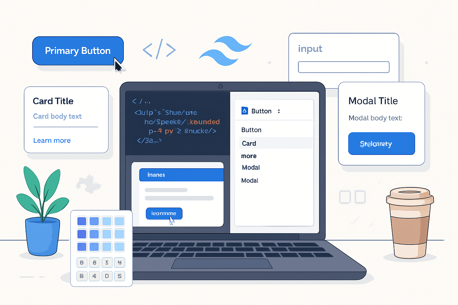
Tailwind CSS Customization: How to Create Your Own Utility Classes
Step-by-step guide to creating custom utility classes in Tailwind CSS - covering theme extension, @layer, addUtilities, matchUtilities, plugins, responsive/variant support, and best practices for scalable projects.
Introduction
Tailwind CSS is designed around utility-first principles, but you will often need project-specific utilities that Tailwind doesn’t ship with out of the box - or that you want to express more explicitly for your design system. This guide walks through practical, scalable ways to add custom utilities: from simple theme extensions to advanced plugin APIs like addUtilities and matchUtilities.
We assume Tailwind v3+ (JIT enabled by default). If you’re on an earlier version, some APIs / behaviors may differ. Official docs referenced throughout: Tailwind Configuration, Plugins, @apply and directives, addUtilities / matchUtilities examples.
Why add custom utilities?
- Fill gaps in Tailwind’s default utilities (e.g., advanced text effects, browser-specific properties).
- Keep design tokens (colors, spacing) in one place via theme extension.
- Create expressive, reusable utilities that map to your design system.
- Package and share common utilities across projects.
Quick overview - options available
- theme.extend in tailwind.config.js: add custom colors, spacing, font sizes, etc.
- CSS @layer utilities and @apply: write utility groups in your CSS file.
- addUtilities (plugin API): register static utilities with variant support.
- matchUtilities (plugin API): generate dynamic utilities from a values map.
- Safelist and content/purge config: ensure dynamically generated classes are preserved.
- Extend the theme (the simplest, most scalable)
If you just need new tokens (colors, spacing, radii), extend the theme. These become available to the existing utility families (bg-, p-, text-, rounded-…). This is the most idiomatic way to keep tokens centralized.
Example: adding brand colors and custom spacing in tailwind.config.js
// tailwind.config.js
module.exports = {
  content: ['./src/**/*.{html,js,ts,jsx,tsx}'],
  theme: {
    extend: {
      colors: {
        'brand-50': '#f5f7ff',
        'brand-500': '#3b82f6',
        'brand-700': '#1e40af',
      },
      spacing: {
        72: '18rem',
        84: '21rem',
      },
    },
  },
};
Now you can use bg-brand-500, text-brand-700, p-72, etc.
- @layer utilities + @apply: small, composable utilities
If you want a few handcrafted utilities that are combinations of existing utilities, use @layer utilities in your CSS and compose with @apply.
/* src/styles/utilities.css */
@tailwind base;
@tailwind components;
@tailwind utilities;

@layer utilities {
  /* A compound utility for a subtle card shadow */
  .card-shadow {
    @apply rounded-xl bg-white/80 dark:bg-slate-800/60;
    box-shadow: 0 6px 20px rgba(13, 17, 23, 0.08);
  }

  /* Utility relying on CSS variables (see theming section) */
  .text-ghost {
    color: rgb(var(--ghost) / 1);
  }
}
Placement: include this CSS file in your build (postcss/tailwind pipeline). Using @layer ensures Tailwind can order utilities properly during processing.
- addUtilities: register raw utilities (static mapping)
Use addUtilities when you want to register CSS rules that Tailwind doesn’t provide, and you want straightforward control over generated class names and variants.
Example: a text-stroke utility (WebKit-based)
// tailwind.config.js
const plugin = require('tailwindcss/plugin');

module.exports = {
  // ...content and theme
  plugins: [
    plugin(function ({ addUtilities }) {
      const newUtilities = {
        '.text-stroke': {
          '-webkit-text-stroke-width': '1px',
          '-webkit-text-stroke-color': 'currentColor',
        },
        '.text-stroke-2': {
          '-webkit-text-stroke-width': '2px',
          '-webkit-text-stroke-color': 'currentColor',
        },
      };
      addUtilities(newUtilities, { variants: ['responsive', 'hover'] });
    }),
  ],
};
Usage:
<h1 class="text-stroke hover:text-stroke-2">Title with stroke</h1>Notes: addUtilities creates static utilities. Provide variants if needed. In Tailwind v3+ you won’t normally pass the variants array (it’s an older API pattern) - the plugin API respects coreVariant utilities or you can call addUtilities with an options object.
- matchUtilities: generate dynamic utilities from a values map (JIT power)
When you want a set of utilities that map to theme values (e.g., CSS properties that vary like rotate/skew/translate or a custom property), use matchUtilities. This is the most powerful and scalable approach for dynamic utility families.
Example: create utilities .text-shadow-{size} that map to theme sizes
// tailwind.config.js
const plugin = require('tailwindcss/plugin');

module.exports = {
  theme: {
    extend: {
      spacing: { xs: '4px', sm: '8px', md: '12px', lg: '20px' },
    },
  },
  plugins: [
    plugin(function ({ matchUtilities, theme }) {
      matchUtilities(
        {
          'text-shadow': value => ({
            'text-shadow': `0 ${value} ${value} rgba(0,0,0,0.25)`,
          }),
        },
        { values: theme('spacing'), type: 'length' }
      );
    }),
  ],
};
Usage:
<p class="text-shadow-sm">Shadowed text</p>This will generate classes like text-shadow-xs, text-shadow-sm, etc., each mapping to the corresponding spacing value.
- Variants, states, and responsive support
Both addUtilities and matchUtilities integrate with Tailwind’s variant system. Use the variants in your HTML as usual:
- Responsive: md:text-stroke-2
- Pseudo-classes: hover:text-shadow-md
- Dark mode: dark:text-shadow-md (if dark mode is configured)
If building a plugin that needs to support arbitrary variants, consult the plugin API docs - matchUtilities maps to theme-based values but you may also declare supports or important behaviors in the options.
- Organizing plugins for large projects
As your project grows, keep custom utilities modular:
- Create a folder like tailwind/plugins/ and add one file per logical set (e.g., spacing-utilities.js, text-effects.js).
- Export functions and import them in tailwind.config.js rather than inlining large plugin code.
Example file structure:
tailwind.config.js
tailwind/
  plugins/
    text-shadow.js
    scrollbars.js
src/
  styles/
    utilities.css
Example plugin file (tailwind/plugins/text-shadow.js):
const plugin = require('tailwindcss/plugin');

module.exports = plugin(function ({ matchUtilities, theme }) {
  matchUtilities(
    {
      'text-shadow': value => ({
        'text-shadow': `0 ${value} ${value} rgba(0,0,0,0.15)`,
      }),
    },
    { values: theme('spacing') }
  );
});
And in tailwind.config.js:
const textShadow = require('./tailwind/plugins/text-shadow');

module.exports = {
  // ...
  plugins: [textShadow],
};- Theming with CSS variables (runtime flexibility)
For runtime theme switching and token composition, combine Tailwind tokens and CSS variables. Define color tokens in the config that reference CSS variables, or use utilities that apply CSS variables.
Example: using CSS variables for a primary color
:root {
  --color-primary: 59 130 246; /* rgb components */
}

.dark {
  --color-primary: 99 102 241;
}
In tailwind.config.js:
module.exports = {
  theme: {
    extend: {
      colors: {
        primary: 'rgb(var(--color-primary) / <alpha-value>)',
      },
    },
  },
};
Now utilities like bg-primary/50 or text-primary will resolve to values based on the CSS variable at runtime.
- Safelist and dynamic classes
If you generate classes at runtime (for example via user data or A/B testing) and those class names are not present in your source files, make sure to include them in the content safelist (formerly purge safelist). In tailwind.config.js:
module.exports = {
  content: ['./src/**/*.{html,js}'],
  safelist: [
    'text-shadow-xs',
    'text-shadow-sm',
    { pattern: /bg-(brand|accent)-(50|100|200|300)/ },
  ],
};- Testing, performance, and bundle size
- Keep utilities minimal and token-based. If you create many static utilities that duplicate Tailwind’s functions, bundle size can grow.
- Use matchUtilities with theme values so classes you actually use are generated by JIT on-demand.
- Run your build in production mode and inspect the generated CSS if you suspect extra rules.
- Packaging and sharing utilities
If you want to share utilities across projects:
- Create an npm package with your plugin(s) and publish them.
- Export a plugin function that accepts options (namespaces, prefixes, default values).
- Respect Tailwind’s plugin contract so consumers can add it to their tailwind.config.js.
Example export pattern:
// my-tailwind-plugins/index.js
const plugin = require('tailwindcss/plugin');

module.exports = function myPlugins(options = {}) {
  return plugin(function ({ addUtilities }) {
    // register utilities using options
  });
};- Examples of useful custom utilities (ideas)
- Scrollbar styles (browser-specific selectors)
- Multi-line truncation utilities using -webkit-line-clamp
- Text stroke / outline utilities
- Custom aspect-ratio helpers (if you want more control than the core plugin)
- Utility to toggle pointer-events for specific interactive states
- Troubleshooting common pitfalls
- Nothing appears: ensure your CSS file with @tailwind directives is included in the build pipeline and that content paths in tailwind.config.js match your source files.
- Classes not generated: make sure you’re using valid class names (matchUtilities creates specific patterns) and check the safelist if class names are constructed dynamically at runtime.
- Variants not applied: confirm dark mode configuration (class vs media) or your plugin registered variants correctly.
Further reading
- Tailwind CSS configuration: https://tailwindcss.com/docs/configuration
- Creating plugins: https://tailwindcss.com/docs/plugins
- Using matchUtilities and addUtilities: https://tailwindcss.com/docs/adding-custom-styles#using-matchutilities
- @apply and directive usage: https://tailwindcss.com/docs/functions-and-directives#apply
Conclusion
Custom utility classes let you tailor Tailwind to your project’s design system without sacrificing consistent, utility-first styles. Start by extending theme tokens for the broadest impact, use @layer + @apply for small composed utilities, and reach for addUtilities / matchUtilities for raw or dynamic CSS you need to generate. Organize plugins, prefer token-driven approaches, and use CSS variables when runtime theming is required. These patterns will keep your Tailwind setup scalable, testable, and easy to share.