· 6 min read
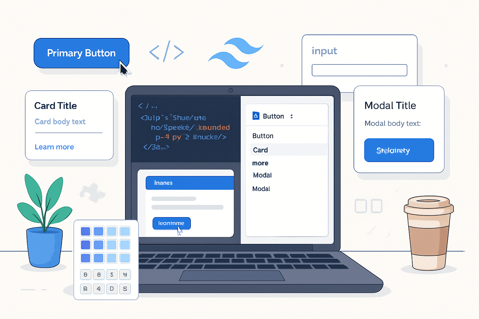
Creating a Component Library with Tailwind CSS: A Practical Guide
Step-by-step tutorial for building a reusable, accessible component library using Tailwind CSS. Includes Tailwind config, @apply components, React component patterns, theming, Storybook, testing, and publishing tips with full code examples.
Introduction
Tailwind CSS is a utility-first framework that makes building consistent UI fast and predictable. But for larger products you want reusable, well-documented components: buttons, cards, inputs, modals, etc. This guide shows a practical workflow for creating a component library with Tailwind CSS - from planning and config to implementation, theming, accessibility, Storybook integration, and publishing.
We’ll cover both plain CSS-driven components (using Tailwind’s @apply) and framework components (React examples). Links to official docs and tools are included so you can deep-dive where you like.
References
- Tailwind CSS: https://tailwindcss.com/
- Storybook: https://storybook.js.org/
- Headless UI: https://headlessui.dev/
- Radix UI: https://www.radix-ui.com/
- MDN Accessibility/ARIA: https://developer.mozilla.org/en-US/docs/Web/Accessibility/ARIA
- Plan your design tokens and scale
Before you build components, plan the tokens and scales you’ll rely on. Tailwind already provides scales (spacing, font-size, colors), but decide which keys you’ll use, which color names, and any additional tokens (like roundedness, elevation) you want exposed.
Example decisions:
- Spacing: use Tailwind’s 0-96 scale
- Colors: semantic names - primary, neutral-50..900, success, danger, warning
- Radii: sm, md, lg
- Elevation: shadow-none, shadow-sm, shadow-md
Add these to tailwind.config.js so they become authoritative.
Example tailwind.config.js
// tailwind.config.js
module.exports = {
  content: ['./src/**/*.{js,jsx,ts,tsx,html}'],
  theme: {
    extend: {
      colors: {
        primary: {
          50: '#f0f9ff',
          100: '#e0f2fe',
          500: '#0ea5e9', // primary-500
        },
        neutral: {
          50: '#f9fafb',
          100: '#f3f4f6',
          900: '#111827',
        },
      },
      borderRadius: {
        md: '0.5rem',
      },
      boxShadow: {
        sm: '0 1px 2px rgba(0,0,0,0.05)',
        md: '0 4px 8px rgba(0,0,0,0.08)',
      },
    },
  },
  plugins: [],
};- Set up base styles and component layer using @apply
Tailwind’s @apply allows you to compose utilities into semantic classes. That’s a great way to create a CSS-driven component library (framework-agnostic) that still benefits from Tailwind’s utility engine.
Create a CSS file (src/styles/components.css) and use layers to expose components.
/* src/styles/components.css */
@tailwind base;
@tailwind components;
@tailwind utilities;

@layer components {
  .btn {
    @apply inline-flex items-center justify-center px-4 py-2 rounded-md font-medium select-none;
  }

  .btn-primary {
    @apply btn bg-primary-500 text-white hover:bg-primary-600 shadow-sm;
  }

  .btn-ghost {
    @apply btn bg-transparent text-primary-500 hover:bg-primary-50;
  }

  .card {
    @apply bg-white rounded-md shadow-md p-4;
  }

  .input {
    @apply block w-full px-3 py-2 rounded-md border border-neutral-200 focus:(outline-none ring-2 ring-primary-200);
  }
}
Why @layer components? It makes sure your classes are part of the compiled CSS in the components layer and play nicely with Tailwind’s ordering.
- Build accessible React components
While CSS classes are reusable across frameworks, many teams prefer component wrappers for API surface, prop handling, and accessibility logic. Below is a typical React Button component using Tailwind classes with a variant system and proper ref forwarding.
Install helpers:
npm install clsx
# or
yarn add clsx
Button.tsx (React + TypeScript)
import React from 'react';
import clsx from 'clsx';

type Variant = 'primary' | 'ghost';

type ButtonProps = React.ButtonHTMLAttributes<HTMLButtonElement> & {
  variant?: Variant;
  size?: 'sm' | 'md' | 'lg';
};

export const Button = React.forwardRef<HTMLButtonElement, ButtonProps>(
  ({ variant = 'primary', size = 'md', className, children, ...rest }, ref) => {
    const base =
      'inline-flex items-center justify-center font-medium select-none rounded-md';

    const sizes = {
      sm: 'px-3 py-1.5 text-sm',
      md: 'px-4 py-2 text-base',
      lg: 'px-6 py-3 text-lg',
    };

    const variants = {
      primary: 'bg-primary-500 text-white hover:bg-primary-600',
      ghost: 'bg-transparent text-primary-500 hover:bg-primary-50',
    };

    return (
      <button
        {...rest}
        ref={ref}
        className={clsx(base, sizes[size], variants[variant], className)}
      >
        {children}
      </button>
    );
  }
);

Button.displayName = 'Button';
Notes:
- Use clsx (or classnames) to compose conditional classes cleanly.
- Forwarding ref helps consumers integrate with forms and focus management.
- Keep prop API minimal and predictable - variant + size + className.
- Compose complex components (Card, Input, Modal)
Card component pattern (composition with children):
export const Card: React.FC<{ className?: string }> = ({
  className,
  children,
}) => {
  return (
    <div className={clsx('bg-white rounded-md shadow-md p-4', className)}>
      {children}
    </div>
  );
};
Input component with error state:
type InputProps = React.InputHTMLAttributes<HTMLInputElement> & {
  error?: string;
};

export const Input = React.forwardRef<HTMLInputElement, InputProps>(
  ({ error, className, ...rest }, ref) => {
    return (
      <div>
        <input
          ref={ref}
          className={clsx(
            'block w-full px-3 py-2 rounded-md border',
            error ? 'border-red-500' : 'border-neutral-200',
            className
          )}
          {...rest}
        />
        {error && <p className="mt-1 text-sm text-red-600">{error}</p>}
      </div>
    );
  }
);
Modal: prefer to use a headless primitive (Headless UI or Radix) for accessibility. Example using Headless UI’s Dialog (see docs): https://headlessui.dev/
- Theming and runtime color switching
For dynamic themes (light/dark or brand switching), combine Tailwind and CSS variables. Define CSS variables in :root and map them in tailwind config with the colors function or keep Tailwind colors and use utility classes for dark mode.
Simple approach: use Tailwind’s dark mode class-based strategy in config:
// tailwind.config.js
module.exports = {
  darkMode: 'class',
  // ...
};
For runtime brand colors, set CSS variables on the root and reference them in your components via custom classes using var(—color-primary).
- Documentation with Storybook
Storybook provides an isolated playground for components, documentation, and visual tests.
Install and init Storybook:
npx sb initAdd a preview wrapper to include your Tailwind CSS in Storybook (preview.js). Document variants for each component and include args for interactive controls.
Useful Storybook addons:
- Docs (built-in)
- Controls
- Accessibility (a11y)
Official Storybook: https://storybook.js.org/
- Visual regression and accessibility testing
- Visual regression: Chromatic, Percy, or Playwright/VRT setups.
- Accessibility: Use axe-core or the Storybook a11y addon to catch ARIA issues early.
- Packaging and distribution
If you’re publishing a framework-agnostic CSS bundle, compile your Tailwind CSS and publish the CSS file. If you’re publishing a component library (React), bundle with a proper build setup (Vite, Rollup, or tsup) and export both ESM and CJS. Consider a monorepo if you need multiple packages (components + CSS).
Quick publish checklist:
- Build: transpile TypeScript and generate ESM/CJS
- CSS: generate Tailwind CSS output for consumers or include source files + tailwind config guidance
- Types: include TypeScript declaration files (.d.ts)
- README: usage, import examples, theming
Example package scripts (package.json):
{
  "scripts": {
    "build": "tsc && rollup -c",
    "build:css": "NODE_ENV=production npx tailwindcss -i ./src/styles/components.css -o ./dist/styles.css"
  }
}- Best practices
- Think API first: design the component props before implementation.
- Keep components small and composable: prefer composition over large monolithic components.
- Accessibility by default: keyboard focus, ARIA, and proper roles.
- Minimal runtime logic: leverage Tailwind for styling and keep JS for behavior and state.
- Theming: prefer semantic color names (primary, surface, text) rather than raw colors.
- Documentation: story examples, visual tests, and a changelog.
- Performance: purge unused classes (Tailwind’s content option) and ship only what you need.
- Tests: unit tests for behavior, visual tests for regressions, and a11y audits.
- Real-world examples and patterns
- Variant maps: maintain your variant-to-class mapping in a single place (like the Button example above) to avoid duplication.
- Utility bridging: when a user passes className, always merge last so they can opt out or extend styles.
- Headless primitives: rely on Headless UI or Radix for complex ARIA patterns (menus, popovers, dialogs).
Small example: Variant map with typed keys (TypeScript)
const buttonStyles = {
  base: 'inline-flex items-center justify-center rounded-md font-medium',
  variants: {
    primary: 'bg-primary-500 text-white hover:bg-primary-600',
    ghost: 'bg-transparent text-primary-500 hover:bg-primary-50',
  },
} as const;

type ButtonVariant = keyof (typeof buttonStyles)['variants'];- Example repository structure
Suggested layout for a React + CSS component library:
- package.json
- src/
- components/
- Button/
- Button.tsx
- Button.stories.tsx
- Input/
- Button/
- styles/
- components.css
- index.ts (exports)
- components/
- dist/ (built output)
- storybook/
- Final notes
Creating a component library with Tailwind CSS is about balancing the utility-first approach with semantic, reusable APIs. Use Tailwind’s config to lock down your design language, @apply for framework-agnostic CSS components, and wrapper components in your framework of choice for accessibility and runtime behavior.
Useful resources
- Tailwind CSS docs: https://tailwindcss.com/docs
- Headless UI: https://headlessui.dev/
- Radix primitives: https://www.radix-ui.com/
- Storybook: https://storybook.js.org/
- MDN ARIA: https://developer.mozilla.org/en-US/docs/Web/Accessibility/ARIA
If you follow the patterns above you’ll end up with a maintainable, well-documented component library that scales across teams and products.